Back in November 2016, Google posted on its webmaster blog that it will be rolling out a mobile first search engine index. Google’s search engine index is a listing of websites, links, and documents that it has discovered by crawling the web from a desktop browsers perspective, however with the mobile first index, google will change the view and now they will crawl the web from the mobile web browser perspective. Going forward Google will show results based on the mobile version of content even for desktop searches.
For website owners following responsive website designs, there is no need to worry because users are served the same content be it for mobile or desktop.
However, if you are using a separate mobile site (m.examplewebsite.com) to present custom content for your mobile users by dynamic serving technique you must be a bit careful. Google’s algorithm is not tracking the actual page which is seen by users so when a mobile page has lesser content than a desktop page, that can lead to a poorer user experience. Mobile first index has not been rolled out yet but we hear it is coming out soon. Google also announced that they would continue to maintain a single index and only use the mobile version of content to rank pages.
Recommendations for website owners:
If you have a responsive website with the same content and structured data across mobile and desktop site, you don’t have to worry. However, if your site has different configuration and content for desktop and mobile site, Google recommends making the following changes:
- Make sure to have structured markup/ data for both mobile and desktop sites, If you don’t make these changes than you fear the risk of showing the mobile page with inadequate and suboptimal content in the mobile first ranking index
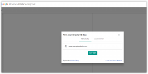
- Compare the structured markup across mobile (m.examplewebsite.com ) and desktop (www.examplewebsite.com) versions of the site by using googles structured data testing tool.
- Go to https://search.google.com/structured-data/testing-tool/u/0/, add your url, run the test.

- Add structured data to your mobile site but remember to be selective and add only those markup’s that may be relevant to the content on the page. Avoid adding additional mark data.
- Use the txt testing tool to determine if your site is accessible to google web crawlers.
- Tip: If you are building a mobile site, a working and fully functioning desktop website would be a better option than a partially done mobile site. So, don’t hurry and push out a partly complete mobile site.
2017 will be an exciting year for digital marketing, especially with Googles push to roll out the mobile first index, they are responding to the changing habits and needs of today’s online consumer who are always connected and engaging. While change brings with it challenges, it can be truly rewarding if you kept up with the changes. Should you like more information to build and or revamp your website be it mobile or desktop, Milestones team of experts with over 18 years of experience are here to help you, please feel free to reach out to us, [email protected] or +1-408-200-9055.
Contributed by: Gaurav Varma, Product Marketing Manager
January 23, 2017


